


JASON
To promote our film we will need to focus on Cross Media Promotion where we will use different ways of advertising. We start with our posters which is always a main way of promoting a film.

We have two posters both with the face of a clown the title and tag line. There are only slight changes with the picture. The fonts are kept the same to keep continuity and synergy in our product so that when people see the picture of a clown or see the distinctive red and white 'k' or maybe the tag line 'funny.....right' people will see this and know it is all to do with the new film 'Klowns' it helps with our CMP and give a theme to our film which is a good way to get it popular.

There are different ways to then promote our film using advertising or technology. Here I have put the poster on a billboard to show how it would look. This would be a good way to get people aware of the film.

We would get with big magazines and get front page coverage to promote the film which is another way to promote our film.

We will use the internet to do this is also. Make a website, themes, adverts, promos, app's; for smartphone, tablets and chrome, Xbox and PS3 themes and much more.
After our film comes out in cinema and then is ready to release for people to watch at home. We would release on BlurayDisc and DVD as shown here.

BERRY
What things did we do that created synergy.
 The continuous use of the colours black, white and red is an example of how we used synergy to make our magazine front cover and poster cohesively relate to each other. The audience will then be able to identify and relate our products to each other, increasing the awareness 'KLOWNS'. The colours used in the poster and magazine cover each represent important features in our teaser trailer. The red represents the blood of the victim on the hammer towards the end of the trailer. The t-shirt the actress wore was a crisp white which ties in with the bold white colour of the headline on the poster. The black used on the poster and magazine from cover reflected the 'eerie' ambience of the teaser trailer.
We ensured that we used the same actor who featured as the klown on our poster and magazine cover. The consistent use of the same actor allows our product to be easily recognised. His eye-catching makeup and snarling expression is also kept the same in order to keep the cohesive look.

The actors face on both the magazine cover and the poster is only a partly shown whist the rest of his face blends in with the dark background. This reflects the mystery which we created in the teaser trailer as his face was not shown at all. The products all work together to build a picture of how the klown may look. They consistently each show a part of the klown without giving away his full identity. Our aimed has been achieved through our the synergy of our three products.
REBECCA
Promoting our media products were quite simple as we did it all our self through websites such as Facebook and you tube but actually creating a buzz for it was much more challenging. I do feel however that our media products (movie trailer, poster and magazine front cover) works very well together as a promotional package as we managed to maintain brand continuity throughout.
.jpg)
 Personally i used Facebook and Twitter to make people aware of our video ensuring as much people as possible watch it. Many people are now using smart phones so it is very likely that people were viewing our media products on the go on the smaller screens of their phones. This I feel is beneficial to us as people can access it anywhere and are more likely to view them. I do not believe that viewing our products on smart phones will be a problem and i have an iPhone and was able to easily view them and zoom into places without any pix-elation.
Easy to view our products on the go through Facebook or Youtube! >>>>>>>>>>>>>>>>>>>>>>>>>>>>>>
Our branding i feel also helped and we kept the same sort of theme throughout our products. For example we continuously used the colors black, white and red. Even the killer follows this color scheme with his make up.
The 'K' in klowns is also iconic and something that can be used as branding for our film.
The style of our title is also easily recognizable and easy to associate with our film. we had used a ransom type style Font.
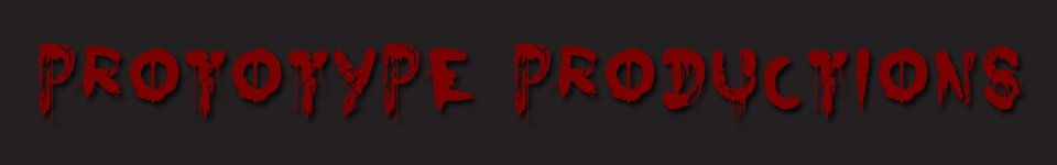
HOALIE
Brand Identity
A brand is a name, term, design, symbol, or any other feature that identifies one seller's good or service as distinct from those of other sellers. So for us we had to create a very unique and distinctive Film title/Killer character for our film so that it is easily recognisable by the audience and is referred back to our film.

Here is our title/logo that we have created to be distinctive for our horror film, This is a Brand identity we have given the film so that if it was seen on the public streets it would be recognised to be our film.

Public advertising is a great opportunity for brand awareness. Buses are a great way of advertising as its very common on the streets of London, pedestrians, people in cars and also people on the bus will see these advertisement. So by putting it on the side of London buses, The film will be known by the public, Those who are not interested will also know about the film which makes this a form of 'push' advertisement.

Another great way of getting the film recognised is by advertising it on the side of a bus stop shelter. It will be seen by pedestrians and people waiting for the bus. This will be seen by our main target audience, which are students of about 18-24 working class people, They are less likely to own a car so will more likely to take buses, and waiting at the bus stop they will see this and will become interested and may want to watch the film. This will make them very aware of the film title which is our brand we want to get known, this can lead to a word of mouth promotion as this generation uses social networking sites the most.

Building and Subway billboards are also a way of getting the film brand known. They will be seen by people waiting for the tube or by passing cars/cars stuck in traffic. Because these billboard are large in size they could be seen from a far distance.
So by combining our posters and using a range of advertising methods we could get a great deal of Brand Identity and be known for the type of font used


0 comments:
Post a Comment